A Bootstrap Card is a flexible and extensible content container. A Bootstrap Card is a bordered box with some padding around its content. It includes options for headers, footers, content, colors, etc.
Bootstrap Card is built with as little markup and styles as possible but still manages to deliver a ton of control and customization. Built with flexbox, they offer easy alignment and mix well with other Bootstrap components.
<html lang="en">
<head>
<title>Bootstrap Card Example</title>
<meta charset="utf-8">
<meta name="viewport" content="width=device-width, initial-scale=1">
<link rel="stylesheet" href="https://maxcdn.bootstrapcdn.com/bootstrap/4.5.2/css/bootstrap.min.css">
<script src="https://ajax.googleapis.com/ajax/libs/jquery/3.5.1/jquery.min.js"></script>
<script src="https://cdnjs.cloudflare.com/ajax/libs/popper.js/1.16.0/umd/popper.min.js"></script>
<script src="https://maxcdn.bootstrapcdn.com/bootstrap/4.5.2/js/bootstrap.min.js"></script>
</head>
<body>
<div class="container">
<h2>Bootstrap Card</h2>
<div class="card">
<div class="card-body">Bootstrap card Example</div>
</div>
</div>
</body>
</html>
<!DOCTYPE html>
<html lang="en">
<head>
<title>Bootstrap Card Example</title>
<meta charset="utf-8">
<meta name="viewport" content="width=device-width, initial-scale=1">
<link rel="stylesheet" href="https://maxcdn.bootstrapcdn.com/bootstrap/4.5.2/css/bootstrap.min.css">
<script src="https://ajax.googleapis.com/ajax/libs/jquery/3.5.1/jquery.min.js"></script>
<script src="https://cdnjs.cloudflare.com/ajax/libs/popper.js/1.16.0/umd/popper.min.js"></script>
<script src="https://maxcdn.bootstrapcdn.com/bootstrap/4.5.2/js/bootstrap.min.js"></script>
</head>
<body>
<div class="card" style="width: 18rem;">
<img class="card-img-top" src="bootstrapcard.png" alt="Card image cap">
<div class="card-body">
<h5 class="card-title">EMLOYEE NAME</h5>
<p class="card-text">Some example text some example text. Here you can add content of card...</p>
<a href="#" class="btn btn-info">View Profile</a>
</div>
</div>
</body>
</html>
Bootstrap Card is built with as little markup and styles as possible but still manages to deliver a ton of control and customization. Built with flexbox, they offer easy alignment and mix well with other Bootstrap components.
Basic Bootstrap Card Example
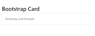
A basic bootstrap card is created with the .card class, and the content inside the card has a .card-body class.Code :
<!DOCTYPE html><html lang="en">
<head>
<title>Bootstrap Card Example</title>
<meta charset="utf-8">
<meta name="viewport" content="width=device-width, initial-scale=1">
<link rel="stylesheet" href="https://maxcdn.bootstrapcdn.com/bootstrap/4.5.2/css/bootstrap.min.css">
<script src="https://ajax.googleapis.com/ajax/libs/jquery/3.5.1/jquery.min.js"></script>
<script src="https://cdnjs.cloudflare.com/ajax/libs/popper.js/1.16.0/umd/popper.min.js"></script>
<script src="https://maxcdn.bootstrapcdn.com/bootstrap/4.5.2/js/bootstrap.min.js"></script>
</head>
<body>
<div class="container">
<h2>Bootstrap Card</h2>
<div class="card">
<div class="card-body">Bootstrap card Example</div>
</div>
</div>
</body>
</html>
Output:
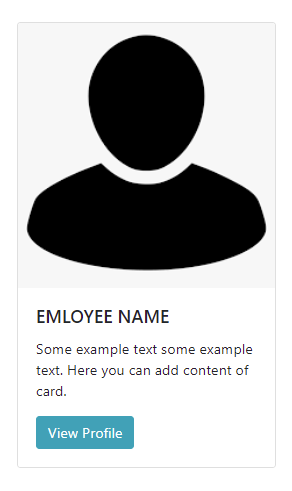
Below is another example of a basic card with mixed content and a fixed width. Cards have no fixed width to start, so they’ll naturally fill the full width of their parent element. This can be easily customized with various sizing options.
<!DOCTYPE html>
<html lang="en">
<head>
<title>Bootstrap Card Example</title>
<meta charset="utf-8">
<meta name="viewport" content="width=device-width, initial-scale=1">
<link rel="stylesheet" href="https://maxcdn.bootstrapcdn.com/bootstrap/4.5.2/css/bootstrap.min.css">
<script src="https://ajax.googleapis.com/ajax/libs/jquery/3.5.1/jquery.min.js"></script>
<script src="https://cdnjs.cloudflare.com/ajax/libs/popper.js/1.16.0/umd/popper.min.js"></script>
<script src="https://maxcdn.bootstrapcdn.com/bootstrap/4.5.2/js/bootstrap.min.js"></script>
</head>
<body>
<div class="card" style="width: 18rem;">
<img class="card-img-top" src="bootstrapcard.png" alt="Card image cap">
<div class="card-body">
<h5 class="card-title">EMLOYEE NAME</h5>
<p class="card-text">Some example text some example text. Here you can add content of card...</p>
<a href="#" class="btn btn-info">View Profile</a>
</div>
</div>
</body>
</html>

